
textarea
Syntax
| A | B | C |
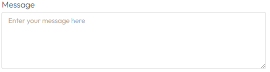
| Message | textarea |
Validation (Column D)
Use these to ensure the data entered by the user meets predefined criteria, such as format or range, thereby ensuring the accuracy and consistency of the data (Read more):
required
Checks that the field is not empty.
rows=number
Indicates the height in the number of lines of your input field.
| A | B | C | D |
| Message | firstName | required,rows=3 |
Settings (Column G)
Used these to configure the behavior and appearance of fields, such as determining the number of decimal places in a numeric output or controlling when a field is displayed based on other input values (Read more).
hidden:true
Hides the field
showIf:logicid=value
Hides the field until the field with the logic id you define has the value you have entered.
Example
{showIf:insurance=Yes}In this example, we only show the input field if the field with the logic id "insurance" has the value "Yes", for example for use on buttons with the options "Yes" and "No"
hideIf:logicid=value
Shows the field until the field with the logic id you define has the value you have entered.
Example
{showIf:insurance=No}In this example, we only hide the input field if the field with the logic id "insurance" has the value "No", for example for use on buttons with the options "Yes" and "No"
Multiple Settings
You can apply multiple settings to an input field by combining them inside one {} block, separated by commas. This allows you to control both logic and appearance.
Example 1:
{symbol:m²=after,showIf:insurance=Yes}Adds "m²" after the input and only shows the field if the input with logic ID insurance is “Yes”.
Example 2:
{symbol:fa-user=before,hideIf:membership=No}Shows a user icon before the input and hides the field when membership equals “No”.
You can mix settings freely to match both design and logic needs.