
CSS
Overview
The Modern 2.0 contains a list of CSS variables that make it easier to change and update the look of your calculator. The variables are named so they should make sense for the most part.
You can find the list of the most commonly used variables here:
General colors | |
| Code | Description |
| The main color used everywhere on the site |
| Default color for all borders on the site |
| Default color used for when an input field is focssed |
| The background color for the <body> element, can be set to an image url as well |
| Default color used when showing errors |
| Default text color |
| Default text color used where a bright font work better |
| Default color for the icons inside a input field |
| Default background color for the icons inside a input field |
| Default input background color |
| Default textarea background color |
| Default input placeholder color |
| Default background color for buttons inside the form |
| Default background color for the box containing the input fields (“mainbody”) |
Fonts | |
| Code | Description |
| Default font |
| Default font size |
| Default font weight |
| Default font weight for the <b> and <strong> elements |
Layout | |
| Code | Description |
| Max width of box containing the calculator itself, use unset to use full width |
| The shadow settings for the “mainbody” box containg the calculator itself |
| Border radius setting for “mainbody” |
Layout, when embedded (iframe) | |
| Code | Description |
| Removes the background from the <body> element so the background behind the iframe is visible |
| Padding for the <body> element when embedded |
| Full page width when embedded |
Border | |
| Code | Description |
| Default border size |
| Default border style |
| Default border radius |
Labels and headings | |
| Code | Description |
| Default font size for each input label/title |
| Font used in each input label/title |
| Font weight used in each input label/title |
| Default textalign for each input label/title |
| Default font size used in each input label/title |
| Default font weight used in each input label/title |
| Default color used in each input label/title |
Transition | |
| Code | Description |
| Default easing used in transitions |
| Default transition speed used in transitions |
| Default target in transitions |
Progress bar (Quiz mode) | |
| Code | Description |
| Default color for the progress bar |
| Default color for the progress bar when finished |
| Default transition used for the progressbar animation |
Quiz Buttons (Previous and Next) | |
| Code | Description |
| Default color for the quiz buttons |
| Default chevron icon used on the previous button |
| Default color used for the chevron icon on the previous button |
| Default chevron icon used on the next button |
| Default color used for the chevron icon on the next button |
Slider | |
| Code | Description |
| Default background color for the slider |
| Default background color for the selected/colored part of the slider |
| Default color for the slider “handle” |
| Default color for the “pulse”/fade effect on the slider handle Note: Remember to change this if you change “mainColor” |
| Default size for the “pulse”/fade effect on the slider handle |
| Default font size for the min. and max. values |
| Default font weight for the min. and max. values |
| Default font weight for the selected value |
| Default border for the slider |
| Default border radius for the slider |
| Default height for the slider |
| Default slider handle border radius |
| Default slider handle size |
| Defualt slider handle border |
Buttons inside the form | |
| Code | Description |
| Default background color for the buttons |
| Default font size for the buttons |
| Default border radius for the buttons |
| Default max width the buttons can be when not in flex mode |
| Default spacing between the buttons (columns) |
| Default spacing between the buttons (rows) |
| Default color for the selected button |
| Default color for the selected button |
| Default font weight for the selected button |
CTA Buttons | |
| Code | Description |
| Default background color for the CTA buttons |
| Default text color for the CTA buttons |
| Default background color for the “success” CTA button |
| Default text color for the “success” CTA button |
| Default background color for the “primary” CTA button |
| Default text color for the “primary” CTA button |
| Default border radius for the CTA buttons |
| Default padding for the CTA buttons |
| Default border for the CTA buttons |
| Default font size for the CTA buttons |
| Default font weight for the CTA buttons |
| Default text align for the eleCTA buttons |
Make changes to the design
If you want to change some part of the design you simply copy the whole line of the variable you wish to change above, go into your calculator, click on “Insert custom HTML” in the menu to the right:

After that, make sure that you are standing on “Custom HTML” in the popup box, if not simply click on it:
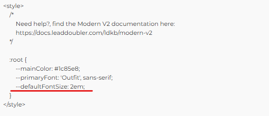
Find the following area:
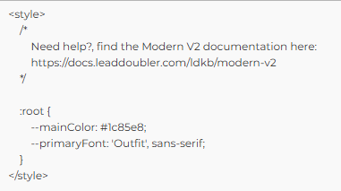
And simply add your copied option and update it to reflect the change you wish to make and press the “Save” button:
Make changes to an element not found in the list
To make changes to something not present in the list above, you need to find out the name of the CSS variable containing the styling, and to do that, the easiest way to do so is using the “developer tools” found in almost all desktop browsers (Chrome, FireFox, Safari, Edge and etc.).
Then once you have found the CSS variable you simply follow the same steps as above.