Input section: column explanation
| A | B | C | D | E | F | G | H |
| Label | Default value | Input type | Validation | Logic id | Tooltip | Settings | Placeholder |
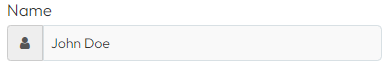
Label (A)
The text in this field is what is displayed above your input fields:

Default Value (B)
The text in this field is the value that the field starts at. For example, if you have a slider that ranges from 0-100 and there is 38 in this field, the slider will always start at 38. The same applies to input fields. For instance, if you have a field named "loan amount" that you want to start at 200,000, just enter 200,000 in column B next to that field:
| A | B | C |
| Loan amount | 200000 | |
| My slider | 38 | slider(0,100) |
Input Type (C)
Here, you define the type of input that you want the field to be.
You can find a list of all input types and how to use them here: Input Types
Validation (D)
Here you define if and how your input should be validated. This could be whether the field should be filled out, whether it can only contain numbers, a certain length, etc. Validations can be combined with each other, see the following example where we state that the field must be filled out and the number must be a number between 1-5:
"required,minvalue=1,maxvalue=5"
Check each individual input type to find out which validation options each field has.
Logic ID (E)
Column E is used to enter what we call logic IDs. A logic ID is used when you need to insert a result on a page, or if you want a specific input to be placed in a specific location on your calculator.
Logic IDs are also used elsewhere in the platform where, for example, you need to refer to a specific field.
As a rule, we always recommend giving your input fields a logic ID, as well as all the output fields you will use.
Logic ID should always be a single word, and we recommend keeping the ID in English to avoid challenges with special characters, as shown in these examples:
- loanAmount
- duration
- firstName
- address
- zip
To place your input field at a specific location on your calculator, you need to enclose your logic ID with square brackets, as shown in this example:
Which then turns into this:
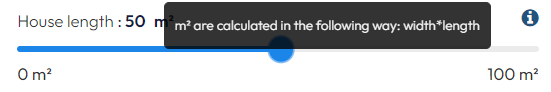
Tooltip (F)
Tooltip is used when you need to provide additional information for an input field, after which an information icon with the text you have entered will be displayed with your input:
Settings (G)
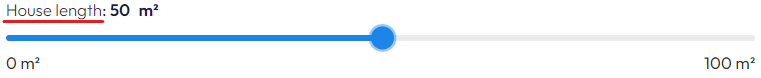
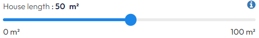
Settings are used, for example, if you want to have "m²" after your number on a slider, or place an icon that indicates what should be in your input field:
Settings must be enclosed by curly brackets, and multiple settings can be chained by separating them with a comma, as shown in this example:
{range:min,symbol:m²=after}
The above example ensures that on a slider it both colors the first part of your slider (the blue part to the left of the handle in the image below) and puts "m²" after every number on the slider:
Check each individual input type to find out which settings each field has.
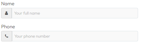
Placeholder (H)
Placeholder is used for types of input fields where the user needs to enter a text. The text you enter here will appear in the field when it's empty, serving as a guide to the user so they can see what needs to be entered:
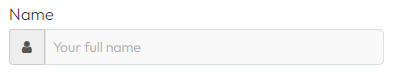
As soon as the user has entered something in the field, the placeholder disappears: